The Psychology of Paint Color & Finishes
How the Right Paint Choices Impact Mood, Behavior, and Curb Appeal
At Van Horn Painting, we’ve been painting homes and commercial properties throughout West Chester, PA, the Philadelphia Main Line, and Northern Delaware for over 15 years. One thing we’ve learned? Paint is never “just paint.”
Color affects how you feel when you walk into a room. It influences how customers behave in a store. It can even impact how well you sleep at night. And when it comes to curb appeal in communities like West Chester, Philadelphia, and Wilmington, the right exterior color and finish can even increase a home’s perceived value.
In this guide, we’ll break down the psychology of paint color and finishes, and how to choose the right combination for your space.
Get the Perfect Finish for Your Home or Business
Let our experts help you choose the right paint. Get your free quote today!
The Psychology of Color: Why It Matters
Color psychology isn’t marketing fluff, it is fundamentally rooted in how our brains process light and the surrounding environment. Different colors, tones, and finishes significantly influence various aspects of human experience, including mood and stress levels, energy and productivity, appetite and buying behavior, the perception of cleanliness and luxury, and even sleep quality. The core principle lies in intentionally applying color to serve the specific function and purpose of the space.
Home Interior & Exterior Paint Psychology
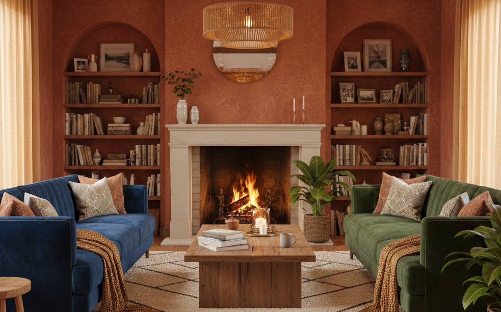
Best Colors For Living Rooms & Family Spaces: Warm neutrals, soft greiges, muted greens, light earth tones.
Why: These shades create a welcoming, grounded feeling. In Main Line homes, we often recommend warm whites or subtle sage tones that feel modern yet timeless.
- Beige and warm taupe → Comfort & conversation
- Soft green → Calm and balance
- Light blue-gray → Relaxed sophistication
Finish Recommendation:
- Eggshell or Satin for durability with a soft glow. Flat finishes look great but can show scuffs in high-traffic areas.
Best Colors For Kitchens: Soft whites, creamy tones, light blues, muted navy accents.
Why: Kitchens are social hubs. Brighter colors subtly stimulate energy and conversation.
- White → Cleanliness & freshness
- Navy → Stability & luxury
- Soft yellow → Warmth & appetite stimulation
Finish Recommendation:
- Satin or Semi-Gloss (especially on trim and cabinets). Kitchens need durability and washability due to moisture and grease.
Best Colors For Bedrooms: This is where psychology really matters.
- Soft blues → Promote sleep and relaxation
- Muted greens → Reduce stress
- Warm neutrals → Cozy and safe
- Deep charcoal or navy accent walls → Security & calm
Bright reds or intense yellows? Not ideal. They stimulate energy and can interfere with sleep.
Finish Recommendation:
- Matte or Flat for walls (soft, calming look)
- Semi-Gloss for trim
Best Colors For Bathrooms: Light, airy tones make small bathrooms feel larger. Moisture resistance is critical here.
- Light gray → Clean & modern
- Pale blue → Spa-like calm
- Crisp white → Fresh and hygienic
Finish Recommendation:
Satin or Semi-Gloss for moisture protection
Exterior Paint For Curb Appeal & Perceived Home Value
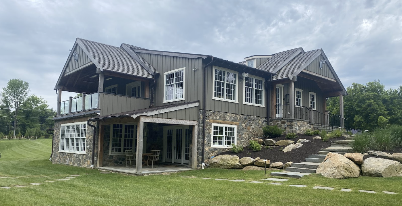
In Chester County and along the Main Line, exterior color plays a major role in resale value.
- Dark charcoal or black accents → Modern luxury
- Creamy whites → Classic elegance
- Blue-gray siding → Stability & trust
- Earthy greens → Blend with wooded lots
A poorly chosen exterior color can make a beautiful home look dated. A professionally selected and applied palette can make it look custom-built.
Finish Recommendation:
- Low-luster / Satin for siding
- Semi-gloss for trim and doors
Gloss level outside affects how light reflects, and in our Pennsylvania climate with strong seasonal sun shifts, that reflection matters.
COMMERCIAL SPACES: Color That Drives Customer Behavior
Commercial painting and the colors businesses choose is not about cosmetics, it’s strategic.
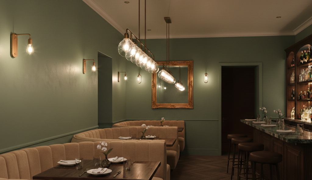
Paint Color For Restaurants
Color selection in a restaurant can directly affect appetite, turnover rate and can influence potential clientele to choose your restaurant.
- Warm reds & terracotta → Stimulate appetite
- Deep greens → Upscale & intimate dining
- Soft neutrals → Modern casual feel
Fast-casual spaces often use energizing colors to increase customer turnover. Fine dining leans toward darker, richer tones.
Finish Recommendation:
- Washable Satin or Semi-Gloss for durability. Restaurants require frequent cleaning.
Paint Color For Retail & Shopping Spaces
Retail color choices influence purchasing behavior. One popular case study is the infamous ‘Target Effect’, where the retail giant’s bold red color (associated with excitement, energy, and urgency) is ideal for motivating its visitors to shop impulsively.
- Blue → Trust and reliability
- Green → Calm spending
- Bold accent colors → Draw attention to displays
Too dark, and the space feels small. Too bright, and customers feel rushed. Lighting + sheen level plays a huge role in how products appear on shelves.
Finish Recommendation:
- Eggshell or Satin on walls
- Higher gloss for feature displays
Paint For Personal Service Businesses (Salons, Spas, Offices)
Here, the goal is comfort and trust.
- Soft grays & greiges → Professional and neutral
- Sage or muted blue → Relaxing
- Warm white → Clean and modern
Glossy walls in these settings can feel harsh. Most clients prefer soft finishes that diffuse light.
Finish Recommendation:
- Matte or Eggshell for walls
- Satin for trim
Paint Color For Warehouses & Industrial Spaces
Color here can affect safety and productivity. Gloss can improve durability in high-impact areas.
- White → Maximizes light reflection
- Light gray → Clean but forgiving
- Safety yellow markings → Visibility
Finish Recommendation:
- Industrial-grade Semi-Gloss or specialty coatings
Matte vs. Glossy: More Than Just Shine
How Paint Sheen Impacts a Space: Choosing the wrong paint sheen, or finish, can compromise the desired effect of your chosen color. This finish critically influences light reflection, which in turn affects the perceived size of the space. Higher-gloss finishes offer greater durability and ease of cleaning, but a significant drawback is that they tend to accentuate any flaws or imperfections on the wall's surface.
Flat / Matte:
✔ Hides imperfections
✔ Soft, modern look
✖ Harder to clean
Eggshell / Satin:
✔ Most versatile
✔ Durable and washable
✔ Ideal for most homes
Semi-Gloss / Gloss:
✔ Highly durable
✔ Moisture-resistant
✔ Reflects light
✖ Highlights imperfections
Why Professional Painting Matters More Than You Think
Here’s the truth: even the best color psychology won’t work if the execution is poor. Professional painting isn’t just about rolling paint on walls. It’s a meticulous process consisting of:
- Proper surface prep
- Correct primer selection
- Even application
- Clean lines
- Understanding how lighting affects color
- Using premium products suited for our local climate
In areas like West Chester and the Philadelphia Main Line, homes and commercial buildings often feature unique architecture, historic stone, custom millwork, and high ceilings. These details demand expertise. A DIY paint job which doesn’t adhere to, and properly execute the steps above, can result in reducing the perceived property value, creating an uneven sheen, leading to premature peeling, and undermining the psychological effect the paint job can ultimately have.
At Van Horn Painting, we help homeowners and business owners choose colors strategically, not just aesthetically. We combine color psychology, local design trends, and professional craftsmanship to create spaces that feel right and perform well… Because in the end, it’s not just about color, it’s about how that color is applied, and how it makes people feel the moment they walk in.
If you’re considering painting your home or commercial space in West Chester, the Main Line, or Northern Delaware, let’s talk. We’ll help you choose the right color, the right finish, and ensure it’s done professionally the first time.
Written by
Brendon Van Horn
Founder & Owner, Van Horn Painting
Brenden VanHorn has spent over 20 years in the professional painting industry, mastering everything from advanced industrial coatings to historic home restoration across Southeastern Pennsylvania. He founded Van Horn Painting over 15 years ago to bring premium craftsmanship, reliable project management, and structural longevity to local property owners.
🛠️ Industry Credentials: